
As an analytics vendor, we’re always keen to respond to our customers’ requests. So recently, we’ve been working hard to add mapping functionality which we will be releasing to our customers in the next few months. Before that however, we thought it might be useful to look at the role of geographic mapping in dashboards and explore when and how to use them.
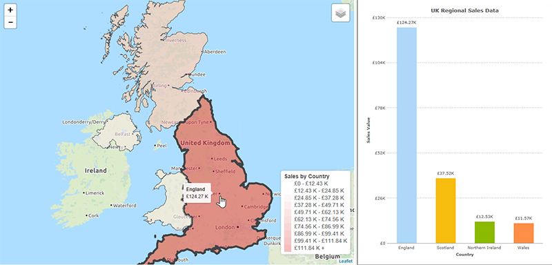
Maps are visually engaging and more exciting than a chart, so it’s tempting to assume that if your data is grouped by some geographical measure then you should be plotting it on a map. However, this is rarely the case. Consider the two displays below, both showing UK Regional Sales data. We already know the areas location, so plotting the data on a map doesn’t add anything. What we’re most interested in is comparing the value sold in each area. Both visualizations display this, the map with colour and the chart with the height of the bar, but it is much easier to get an instantly clear comparison from the chart.
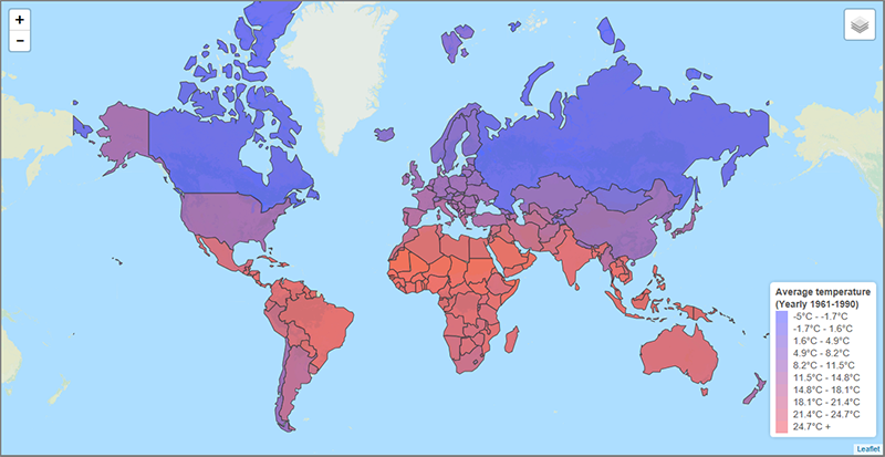
In contrast, take the example below that maps average temperature by country. From a quick glance, we can see that the coldest regions are the large land masses to the North, Western Europe is milder than Eastern Europe and Africa is warmest continent overall. In the context of the data we’re looking at, this is all hugely useful information that would not be apparent at a glance with any other representation of the data. This is a clear example of when plotting the data on a map adds to our understanding.
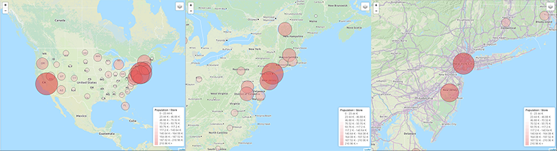
For a more practical example, take the dashboard below. It’s designed to inform the decision as to where a retailer should open their next store. The measure shown on both the map and chart is the population of each state divided by the number of stores, giving a measure of the population per store for each state. Given just the chart, we may choose to open a new store in California. However, the map suggests a different decision. Plotting a circle centred on each state, with the population per store represented by the diameter of the circle, the area surrounding New York contains a high number of overlapping circles. From the map, it’s clear that locating a new store here would potentially cater for more customers than one opened in California.
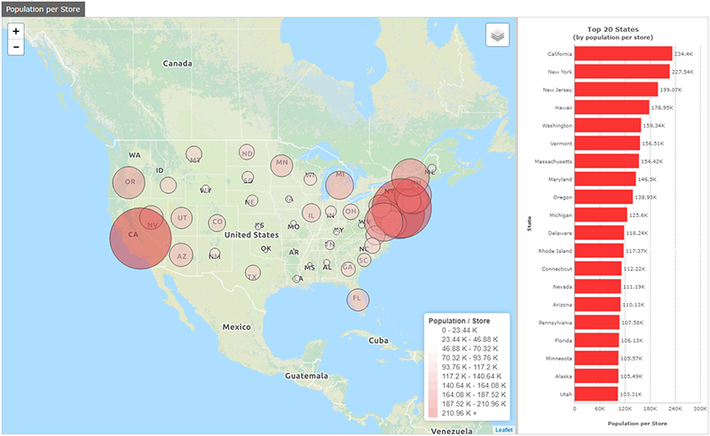
Indeed, the functionality of the map would also let us progressively zoom in and perhaps choose a specific location such as New Brunswick in New Jersey.
When deciding whether to use a map to represent your data, simply ask yourself the following question; does visually expressing the physical location of the data elements add to our understanding of the data? If not, some other object would likely be a better choice. This is in fact just a specific instance of a wider rule we should apply when designing any dashboard; if a visual element does not add to our understanding of the data, it is just clutter that makes the dashboard harder to understand, and as such should not be there.
If you’d like to find out more about DataPA OpenAnalytics, or our forthcoming support for mapping, please contact us.